CMYK vs. Pantone for Custom Packaging Printing
Compare four-color process and spot-color printing for packaging artwork, brand colors, photography, substrates, and proof expectations.
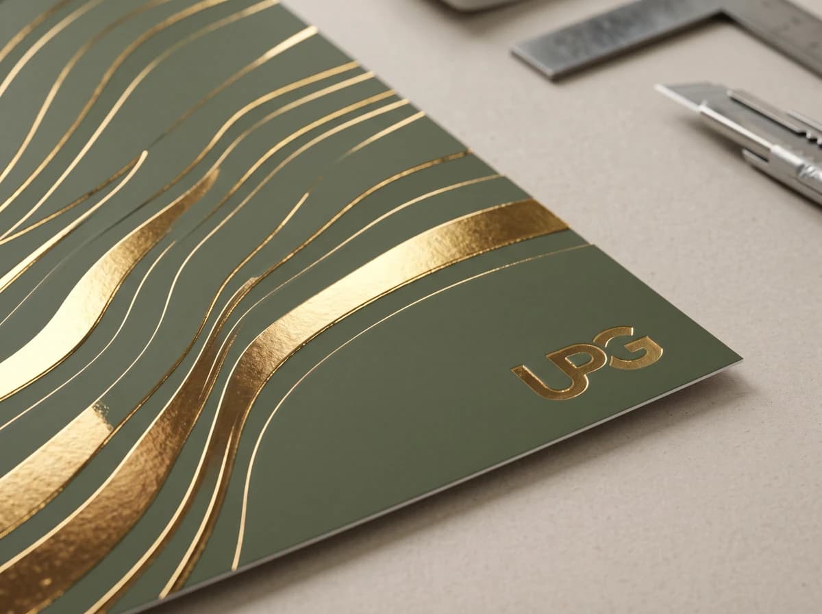
CMYK combines cyan, magenta, yellow, and black process inks to reproduce many colors and is a natural starting point for photographs or complex artwork. Pantone spot colors use specifically identified premixed inks when a smaller set of brand-critical colors needs closer control. The final method depends on the print process and project specification.
Artwork uses many colors
Photography, gradients, and complex illustrations usually point toward a process-color discussion.
A brand color is critical
A named Pantone reference can communicate a specific spot-color target for project review.
Material and print method
The same color intent can appear different across substrates, coatings, finishes, and production processes.
CMYK and spot color solve different artwork problems
- CMYK process color
- Standard cyan, magenta, yellow, and black inks combine in screens
- Pantone spot color
- A specifically identified premixed ink is printed as its own color
- CMYK process color
- Photographs, gradients, illustrations, and many-color artwork
- Pantone spot color
- A small number of brand-critical or specially specified colors
- CMYK process color
- Process-color values and separations
- Pantone spot color
- Named spot-color swatches and separate production callouts
- CMYK process color
- Some spot colors cannot be closely simulated inside a four-color process gamut
- Pantone spot color
- The printed result still depends on substrate, ink, process, coating, and viewing conditions
| Decision | CMYK process color | Pantone spot color |
|---|---|---|
| How color is created | Standard cyan, magenta, yellow, and black inks combine in screens | A specifically identified premixed ink is printed as its own color |
| Natural fit | Photographs, gradients, illustrations, and many-color artwork | A small number of brand-critical or specially specified colors |
| Artwork setup | Process-color values and separations | Named spot-color swatches and separate production callouts |
| Important limit | Some spot colors cannot be closely simulated inside a four-color process gamut | The printed result still depends on substrate, ink, process, coating, and viewing conditions |
CMYK means four process inks: cyan, magenta, yellow, and black. It does not mean four PMS spot inks. A Pantone/PMS spot color is a separately premixed ink. On a conventional plate-based offset job, each spot-color separation uses its own plate; digital printing uses a different setup. A project can also use CMYK imagery plus one or more spot colors.
Use CMYK as a starting discussion when
- The artwork contains photography or complex multicolor illustrations.
- Gradients and tonal transitions are important.
- The selected print process and production plan are based on process color.
- The brand accepts an approved process-color build rather than requiring a separate spot ink.
Review Pantone spot color when
- A logo or brand color has a named Pantone specification.
- The project uses only a few controlled colors.
- A particular color sits outside an acceptable CMYK simulation.
- A metallic, fluorescent, or other specially specified ink is being considered.
UPG quotation policy for CMYK and PMS
For UPG quotation purposes, on an otherwise unchanged specification, a CMYK process print basis is treated as equivalent to two PMS colors. This is a UPG commercial quoting policy, not a statement that four CMYK process inks and four PMS spot inks are technically the same.
If the requested artwork needs four PMS colors, CMYK plus spot color(s), or a revised print specification, UPG confirms the available print route and price in the written quote. Do not infer a fee or numeric price from this policy; structure, substrate, size, quantity, finishing, proofing, and the production method still need project review.
Why an RGB screen is not the final print target
Screens display RGB light, while printed packaging uses inks on a physical material. If artwork begins in RGB, its appearance can change when converted for print because some screen colors fall outside a CMYK print gamut. Supply editable artwork, identify critical brand colors, and review approved production values rather than relying on one monitor display.
Pantone C and U identify the reference paper stock
Pantone C and U refer to coated and uncoated paper reference stocks in the Pantone guide. They are not simply lamination or finish labels. Stock absorption can change the appearance of the same named color, so include the complete Pantone reference and confirm the production substrate, ink system, press process, coating, and proof path for the project.
A practical artwork handoff
- Supply editable source files and linked assets where requested.
- Identify every named spot color clearly.
- Keep process colors defined in the approved color mode.
- Flag colors that are brand critical.
- State whether the artwork is RGB, CMYK, PMS/spot, or CMYK plus spot colors.
- Include the full Pantone reference, including C or U where applicable.
- Record whether the reference is a physical standard, a prior printed sample, or an on-screen approximation.
- Ask UPG to confirm the print route and written price when four PMS colors, CMYK plus spot colors, or a revised print specification is requested.
- Approve the applicable proof within the project criteria.
Frequently asked questions
Is Pantone always more accurate than CMYK?
Pantone spot color can be useful for a specifically identified brand-critical color, but the final appearance still depends on substrate, ink, print process, coating, finish, and viewing conditions. The correct method is project specific.
Can every Pantone color be converted exactly to CMYK?
No. Pantone explains that some spot colors fall outside the process-color gamut and may look different when simulated in CMYK. A physical comparison and the approved production method help set expectations.
Should packaging artwork be sent in RGB?
Send editable source files and identify the intended print colors. RGB is a screen color model and some RGB colors cannot reproduce exactly in CMYK print, so the final separation or spot-color setup follows the approved production specification.
Is Pantone C or U just a finish choice?
No. C and U identify coated and uncoated paper reference stocks in Pantone guides. Stock affects ink absorption and appearance, so include the complete Pantone reference and ask UPG to confirm the production substrate and proof path.
Does UPG price CMYK the same as PMS?
For UPG quotation purposes, on an otherwise unchanged specification, a CMYK process print basis is treated as equivalent to two PMS colors. Four PMS colors, CMYK plus spot color(s), or a revised print specification require written price confirmation. This is UPG's commercial quoting policy; it does not make four CMYK process inks technically equivalent to four PMS spot inks.
Sources used for this guide
Adobe: Photoshop color modes
Primary reference for RGB screen work, CMYK print work, and the effect of print conditions on CMYK range.
Open primary source ↗Adobe: Spot and Process Colors
Primary software reference for how commercial print colors are specified.
Open primary source ↗Pantone: Coated and Uncoated
Primary reference explaining that C and U identify Pantone reference paper stocks and can produce different visual appearance.
Open primary source ↗